
.gif)
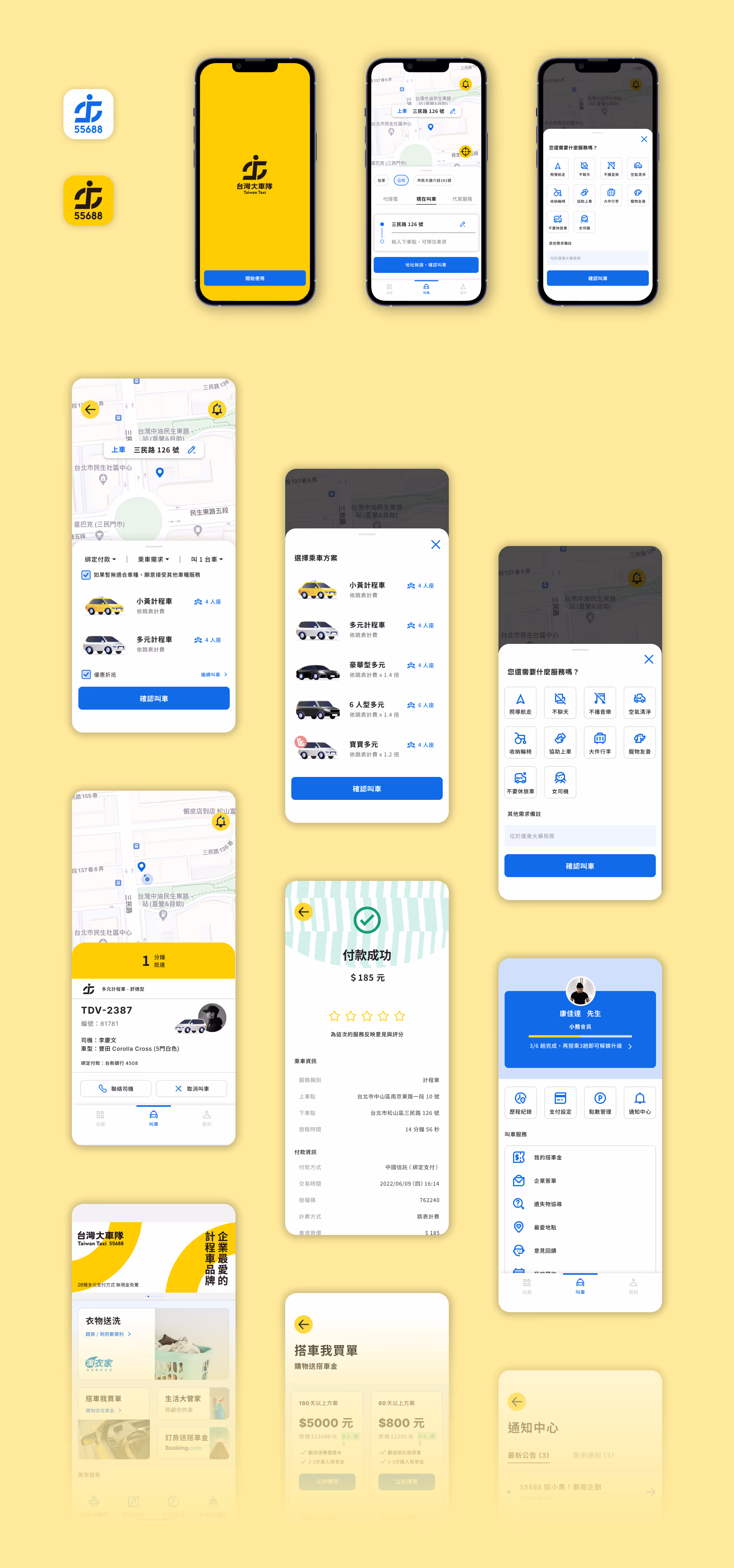
Rebranding strategy and mobile app interface redesign for the largest ride share company in Taiwan.
Taiwan Taxi is the largest and oldest transportation brand in the country. We conducted market surveys and user interviews that validates the need to establish a better and clearer brand image.
Our team developed a fresh visual identity and design system for Taiwan Taxi's mobile app and marketing campaign.
MY ROLE
Product & UI Designer
DURATION
12 weeks
(2022 April - July)
TEAM
Project Manager x1
Visual Design Lead x1
Product & UI Designer (Me)
Deliverables
Design System
Prototype
Animation
Taiwan Taxi, the largest taxi corporation in the country, has undergone a major shift from a phone-call-based service tailored to users above 50 to an app-driven platform for all, since 2011.
As the mobility market evolves, the company faces increasing competition from global players like Uber and Line Taxi, as well as emerging domestic brands such as Yoxi. Taiwan Taxi needs to undergo a strategic rebranding to enhance its digital presence, customer experience, and competitive edge in the rapidly changing transportation landscape.
Taiwan Taxi holds substantial advantages in service quality and nationwide scale, but faces a critical challenge: competitors with sharper branding and stronger digital experiences are rapidly capturing the younger market.
Without a refreshed identity and improved app experience, Taiwan Taxi risks losing resonance with younger, tech-savvy riders.

We conducted 10 interviews to understand the user experience and brand perception among groups of different age and loyalty level.
We collected 360+ survey replies to learn about
1. Brand perception among different generations
2. User experience and service pain points, and
3. Reasons that drove users to other competing brands.

Users recognize Taiwan Taxi’s service quality, but consider the brand image outdated, especially among younger users.
App users struggle to associate the App UI’s color and design with Taiwan Taxi’s logo and branding guidelines.
With early improvements on visual identity, user experience, and app interface design,
Taiwan Taxi can continue to dominant the market and win over young audience who are turning their heads to other brands right now.
Redesign a visual identity that aligns with Taiwan Taxi's top-tier service as a leading professional and innovative ride company.
Establish a new interface design system that enhances the consistency of on and offline services, and to improve the App's usability and enjoyability.


Before
Logo has too many color. Hierarchy and functions are undefined. The colors does not connect with core brand value.

New
Prioritizing yellow and blue as logo color, enhanced luminance for assistive colors to instill energetic feel. These colors are also optimized for digital use and accessibility tested.
The app interface goal is to extend the brand identity and establish a digital use system for the first time.
With a cleaner and more organized visual hierarchy, existing information can be displayed better, enhancing usability and enjoyability.


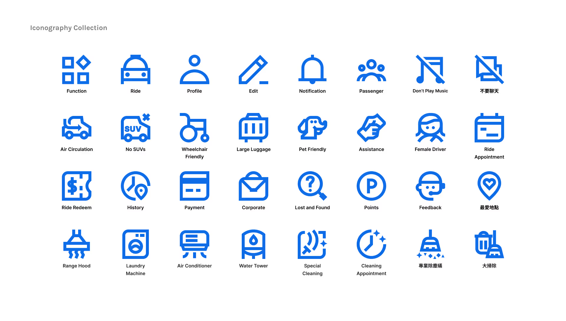


This brand redesign is my first attempt to build iconography and digital design system. The less focus on the UX and information architecture is deliberate, but the constraint poses a challenge when reorganizing the layout of the current interface without proper usability study.